
6 Types of Nonprofit Web Design and When to Use Them
As a nonprofit professional, you know how important it is to convey accurate information about your cause to your supporters. Whether you’re educating them about your mission, sharing success stories, or urging them to donate, having a central hub for information and resources is essential. That’s why having a strong nonprofit website is so important.
With the right design, your nonprofit’s website will be an invaluable part of your marketing and fundraising efforts. Web design that works in tandem with your nonprofit’s overall graphic design strategy can create a website that is functional, user-friendly, and visually appealing to foster deeper relationships with existing supporters and make a strong first impression on new audiences.
In this guide to the types of nonprofit web design, we’ll explore how you can choose the right one for your organization:
- What is web design?
- What are the types of nonprofit web designs?
- What are some tips for improved nonprofit web design?
If you’re unfamiliar with web design, you may feel a little intimidated by all of the new terminology and coding jargon you may have heard. With the tools and resources at your nonprofit’s disposal, this process doesn’t have to be scary. Let’s get started by getting familiar with what web design is.
What is web design?
Web design is the process of conceptualizing and arranging content on a website to promote a positive, engaging user experience.
While website developers tend to focus on building and maintaining the core technical elements on the “back end” of websites, web designers focus on more “front-end” features that impact user experience. More specifically, this process involves choosing layouts, colors, images, links, and other on-page elements. Web designers often combine their technical skills with graphic design tools and strategies to create informative and visually appealing websites.
The goal of web design is to create a website that packages information in the most effective, engaging, and accessible way. The site should capture users’ attention to keep them on the page and provide information that helps the organization meet its goals. For nonprofits, these goals typically include driving donations, memberships, or volunteer sign-ups.
What are the types of nonprofit web designs?
One of the most important factors in creating a strong website is choosing the right web design layout. Next, we’ll explore the six types of web designs and when your nonprofit should use them.
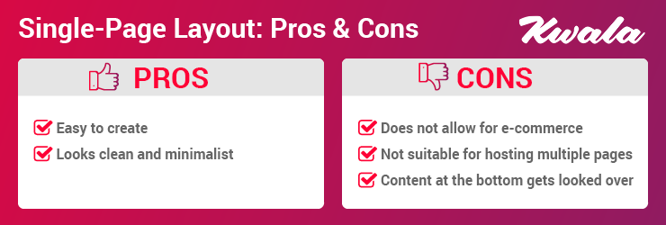
1. Single-page layout
These websites are exactly what they sound like — they use just one page to convey all of their information. The page can be as long as needed and be divided into sections to contain all of the information and resources included on the site, so users can simply scroll through the page without clicking through to any other pages. These pages appear very clean and simple and are easy to create.
However, this style is not ideal in every case. For example, if you need to include a lot of information on your site, the page will grow to be extremely long. Most users likely won’t scroll all the way to the bottom of the page, meaning that the information located near the bottom won’t reach many of your visitors.
Consider this type of web design for your nonprofit if:
- Your organization is relatively young and doesn’t have many resources or stories to share yet.
- You need to create a website within a short timeframe.
- You want a design that is easy to set up.
Single-page web designs are great for nonprofits who are looking to share their story concisely along with just a few key resources. If you’re just getting off the ground and want to develop a website quickly, consider setting up a site using this simple layout.
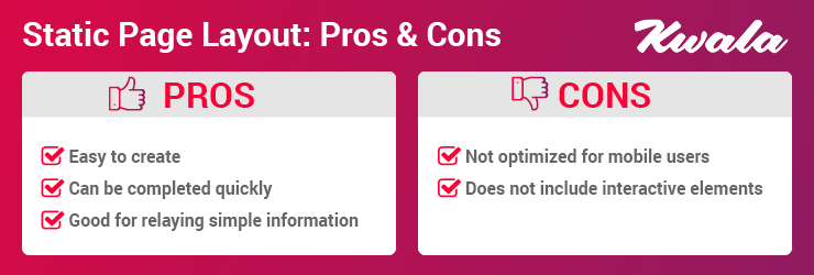
2. Static page layout
This type of design uses permanent, preset page dimensions. In other words, your organization would choose one size for the website (usually one fitted to a desktop browser) that does not change — hence the name “static.”
These layouts usually have few user interactions (like surveys or social sharing buttons) available. Because of the static page dimensions and the lack of interactive elements, these websites are typically low-cost and easy to set up.
While static layouts are one the most basic web designs and are affordable and easy to create, these layouts are not used very often due to their sizing limitations. Static layouts tend to provide a poor user experience for users browsing on their smartphones or tablets. Plus, users can’t interact with pages much, meaning their experience on the website might not be very engaging.
Your nonprofit might choose a static website design if:
- You just want to convey basic information like fundraising event flyers, volunteer opportunities, or your organization’s mission statement on your website.
- You need a cost-effective way to set up a website in a short timeframe.
- Your website won’t change very often.
- You don’t need to include interactive elements such as an online merchandise shop, forums, or social sharing options to accomplish your website’s goals.
Due to the limitations around page size, this layout requires a separate, mobile-friendly version to be successful. Otherwise, important information can be lost to mobile users.
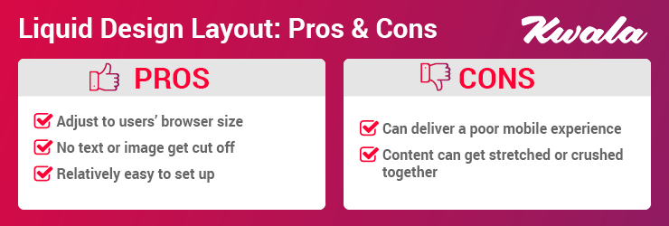
3. Liquid or fluid design layout
Liquid design layouts, sometimes referred to as fluid layouts, have flexible page dimensions rather than rigid, permanent sizes. With a liquid layout, the page will always fit the size of the user’s screen no matter what browser they are using.
However, this layout doesn’t always resize to fit every screen perfectly. For example, a large browser might stretch content while a small one can push content together, making it difficult to read. While these flexible page dimensions are a step up from what static layouts provide, a liquid layout is still susceptible to providing a poor user experience.
Consider choosing this layout for your nonprofit web design if:
- You don’t have the time or resources to create a separate mobile-friendly website.
- You want to improve user experience but don’t have the resources to take on a more advanced layout.
- You want to ensure important information doesn’t get cut off for any users, no matter what device they use.
If you need a web design that is quick and easy to set up but don’t want the drawbacks that come with a static web design, liquid layouts might be the best option for your nonprofit.
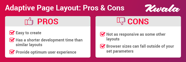
4. Adaptive website layout
Similar to a liquid layout, adaptive web designs change size depending on the size of the user’s browser. However, this style uses queries in a coding language called Cascading Style Sheets (CSS) to detect the size of the browser and adjust accordingly while liquid layouts only use HTML coding.
The size adjustments an adaptive website makes tend to be more accurate than liquid layouts are capable of. Additionally, adaptive layouts adapt the actual content on the page to the user’s screen so they have a better user experience viewing and navigating the site. With a smarter, more flexible layout like this one, you can build a better website that won’t entail any frustrating issues like stretched-out images and stacked or overlapping text.
An adaptive website layout might be right for your nonprofit if:
- You want a website that is easy to set up and prioritizes user experience.
- You want to preserve your website’s design integrity across all devices.
- You want to build a website with an excellent user experience on a relatively tight timeline when compared to more complex layouts.
While its adaptive features might not always work perfectly for browser sizes that fall between your site’s parameters, this layout can help make your website more user-friendly using less time and resources than other, more complex web designs.
5. Responsive design layout
Responsive design layouts adjust their layouts and the way that information is displayed based on the user’s browser size. What makes these layouts unique, however, is that they are built with a mobile-first approach.
With 68.1% of all website visits coming from mobile devices, the importance of providing a positive user experience on these devices cannot be overstated. A responsive design layout prioritizes making this experience a positive one by building out the mobile version of the website first. Then, the desktop size is developed based on the mobile version.
This layout adjusts the on-page elements to each browser size so users never miss the important information you include on your website. For example, it will wrap text and scale images accordingly so mobile users can view the same elements that appear for desktop users. These layouts also prioritize showing the most important elements of the page, like the headline of a blog post, at the top rather than decorative elements.
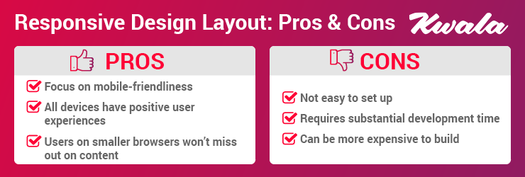
Your nonprofit might benefit from this layout if:
- You have the time and resources to develop a more complex website.
- You want a web design that prioritizes mobile users.
- You want to provide the best possible user experience.
- You don’t want to build a separate mobile website.
This layout is one of the best ways to ensure users have a positive, seamless experience on your website no matter what browser they are visiting on. Be sure to account for the longer lead time on website development as this web design is often more complex to set up.
6. Dynamic website layout
Dynamic web designs are personalized to each user that visits them. The appearance of on-page elements like text and images will change from person to person. These layouts also incorporate more interactive elements.
Often, dynamic web designs are used for sites where users log in to a unique profile, including e-commerce and social media websites. Think back to the last time you logged into your Amazon account, for example. Chances are, the website adapted its layout to include personalized features like filling in your name at the top of the page and alerting you about new deals on products similar to your previous purchases.
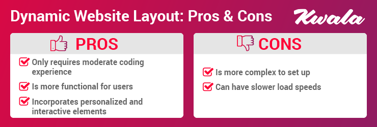
Dynamic layouts are a great option if:
- Your nonprofit’s website content will change regularly.
- Your site allows users to log into unique user profiles.
- You plan to use your website to sell a product like branded merchandise.
- You’re looking for a layout with increased functionality and interactivity that doesn’t require extensive coding experience to build.
If your team is exploring using a dynamic web design, keep in mind that page load speeds can be slower because the page has to fill in the users’ data when they request the page. Motivate users to stay on the page despite the wait with highly engaging interactive elements, and take additional measures to reduce page load speeds like compressing all your image files.
What are some tips for improved nonprofit web design?
In addition to the more technical parts of web design like layouts, there are other more creative aspects to consider as well. Many of these elements use graphic design strategies to stand out by conveying information in a compelling, readable way. Here are a few your organization can use to make your web design stronger.
Get creative with media.
If you’ve ever visited a website that featured text as its only media source, you know how dull and uninteresting it can be to browse those sites. While images are certainly a step up from plain text, there is only so much you can convey with still images alone. That’s where more creative, dynamic media comes in.
Media like videos and GIFs can help convey messaging through a more interactive and engaging channel. Videos can make a strong impact by capturing and conveying strong emotions by incorporating a blend of powerful elements like footage, music, and narrations.
Also, consider incorporating innovative, highly interactive elements like quizzes, calculators, and interactive infographics. For example, if you run an animal rescue, you could include a tool that calculates how many dogs a potential donor’s gift would impact. Elements like these, along with media like videos and GIFs, engage your supporters to keep them on your website longer to move them closer to donating.
Choose a cohesive color palette.
Be deliberate with the colors you choose to incorporate into your website. For example, you should always choose text colors that contrast strongly with your website’s background colors to make the page as accessible as possible. However, you should also focus on choosing a cohesive overarching color scheme that you use throughout your website.
A well-developed color scheme can:
- Strengthen your branding. Choose colors that are consistent with your nonprofit’s branding. Then, when people access your website through search engine results pages, web ads, or marketing emails, they can immediately recognize your organization’s branding in the web design. To boost brand recognition even more, be sure to include your nonprofit’s logo in a prominent place.
- Reinforce your mission. People often have subconscious associations between colors and their meanings — and nonprofit causes are no exception. For example, when you spot a nonprofit organization with a lot of green in its web and logo design, you probably assume its cause has something to do with nature or the environment. Choosing a color people might already align with your cause is a great way to signal your mission visually.
As you choose your color scheme, take care not to get carried away. Using too many colors on your website or in your organization’s branding can muddy your brand identity and make it difficult for supporters to recognize your organization.
Choose a minimalist web design.
When you begin designing your nonprofit’s website, it can be easy to overload the site with ten different colors, excessive images, and long blocks of text. While these elements can make the page more interesting and engaging for users, adding too many of them can clutter your website and even slow down the site’s load speed for users.
Many web designers choose to take a more minimalist approach to design. Minimalist design uses limited color palettes and simple forms without many decorative elements — in other words, every element included in a minimalist design is intentional and serves some kind of purpose. This homepage from the Ford Foundation’s website is an example of the use of minimalist design:
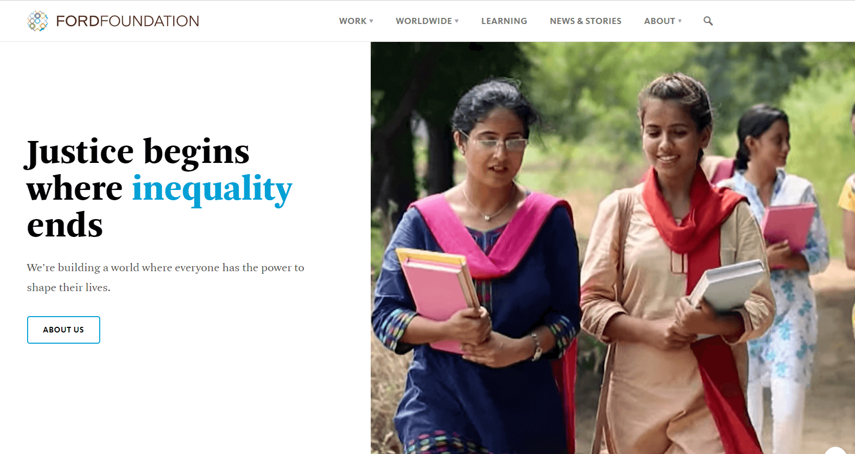
Notice that this design uses a limited color palette and lets the bold typeface and imagery shine. Employing these graphic design tips in your nonprofit’s web design to make visual elements more effective and impactful:
- Use negative space. It’s easy to feel intimidated by empty space on your website. However, don’t rush to fill it in with images or text. Instead, intentionally leave space without any on-page elements on it so you can draw viewers’ eyes to the elements that are on the page.
- Limit text. Avoid crowding your website with paragraph after paragraph of text. While the information you’re conveying might be important, large blocks of text can bog down the site — plus, most readers will just skim them or scroll past them completely. A general rule of thumb is to limit text to one large headline and a few short paragraphs per page.
- Choose just a few images. Images are one of the easiest, most effective ways to add visual interest to your website. But adding too many images can be distracting, causing your viewers’ eyes to flit from photo to photo without finding a central focus to land on. It’s best to either choose just one or two highly impactful images per page or use an image carousel so users can click through the images one at a time.
- Use a limited color palette. Most minimalist web designs use a small color palette made up of three to five colors. In addition to boosting brand recognition, working with just a few colors makes your life easier by reducing the number of colors you have to choose from to a more reasonable number. A common minimalist trend in web design is to stick to mostly neutral shades like black, white, and gray with one or two brighter accent colors that make elements like hyperlinks stand out to users.
To develop a more minimalist design, keep in mind that the goal is to limit on-page elements to those that truly have a purpose in delivering information in a neat, visually appealing package. Aim to create a website that is accessible and user-friendly in all ways, from how your text is formatted to the website’s general functionality.
Work with a graphic design service.
Many nonprofits simply don’t have the time to develop a website built into their schedules. Or maybe you’re looking to improve your existing website to make it more impactful, effective, and consistent with your branding but don’t know where to start. In these cases, using a graphic design service can put you on the right track.
Working with a subscription graphic design service like Kwala can help your nonprofit get in contact with a team of experts to create web designs that convey information about your cause in an engaging way all while staying consistent with your existing branding. The best part is that Kwala specializes in creating high-quality graphic design materials for mission-driven organizations, so its team is knowledgeable and up-to-date on your industry’s unique challenges.
If you decide to work with Kwala, your nonprofit can enjoy perks like:
- Flat monthly fees
- Unlimited requests and revisions
- 21-day money-back guarantee
- A talented graphic designer dedicated to getting to know your mission
- A wide range of offerings from logo designs to flyers to web graphics
Kwala takes the guesswork out of working with a graphic design agency. With its money-back guarantee and unlimited revisions, Kwala ensures that you’ll be satisfied with the work you receive. Contact Kwala today to elevate your nonprofit’s web design!
Wrapping Up
An impactful, user-friendly website can motivate visitors to learn more about your organization and find ways to get involved. As a central information hub, you can direct all prospective supporters to your site to educate and connect with them. Use the tips in this guide as a starting point on your web design journey, but don’t be afraid to reach out to the experts when you have questions!
If you’re curious about leveling up your organization’s graphic design strategy, check out these additional resources:
- 100+ Best Nonprofit Logos to Inspire Your Team. Looking to update your logo? These logos can give your team much need inspiration no matter if you’re nonprofit is devoted to animal rights or youth development and protection.
- 15 Best Nonprofit Graphic Design Examples. Quality graphic design is crucial to building your brand as a nonprofit. Get inspired with these 15 examples of how nonprofits can use graphic design in their marketing strategies.
- Microsoft Ad Grants: An Overview for Your Nonprofit. Ready to take your digital marketing to the next level? Check out this resource all about the Microsoft Ad Grant.