6 Types of Nonprofit Web Design and When to Use Them

As a nonprofit professional, you know how important it is to convey accurate information about your cause to your supporters. Whether you’re educating them about your mission, sharing success stories, or urging them to donate, having a central hub for information and resources is essential. That’s what your website provides.
With the right design, your nonprofit’s website is an invaluable piece of your marketing and fundraising efforts. Web design that works in tandem with your nonprofit’s overall graphic design strategy results in a website that is functional, user-friendly, and visually appealing, enabling you to foster deeper relationships with existing supporters and make a strong first impression on new audiences.
In this guide to the types of nonprofit web design, we’ll explore how you can choose the right one for your organization:
- What is web design?
- What are the types of nonprofit web designs?
- What are some tips for improved nonprofit web design?
If you’re unfamiliar with web design, you may feel intimidated by all of the new terminology and coding jargon you may have heard. With the tools and resources at your nonprofit’s disposal, this process doesn’t have to be scary. Let’s get started by reviewing what web design is.
What is web design?
Web design is the process of conceptualizing and arranging content on a website to promote a positive, engaging user experience. The goal of web design is to create a website that packages information in the most effective, engaging, and accessible way. The site should capture users’ attention to keep them on the page and provide information that helps the organization meet its goals. For nonprofits, these goals typically include driving donations, memberships, or volunteer sign-ups.
While website developers tend to focus on building and maintaining the core technical elements on the “back end” of websites, web designers focus on more “front-end” features that impact user experience. This process involves choosing layouts, colors, images, links, and other on-page elements. Web designers often combine their technical skills with graphic design tools and strategies to create informative and visually appealing websites.
What are the types of nonprofit web designs?
One of the most important factors in creating a strong website is choosing the right web design layout. Let’s explore the six types of web designs and when your nonprofit should use them.
1. Single-page layout
These websites are exactly what they sound like — they use just one page to convey all of their information. The page can be as long as needed and can be divided into sections to contain all the information and resources needed on the site, so users can simply scroll through the page without clicking through to any other pages. These pages appear very clean and simple and are easy to create.
However, this style is not ideal if you need to include a lot of information on your site, as the page will grow to be extremely long. Most users likely won’t scroll all the way down the page, meaning that the information located near the bottom won’t reach many of your visitors.
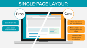
Consider this type of web design for your nonprofit if:
- Your organization is relatively young and doesn’t have many resources or stories to share yet.
- You need to create a website within a short timeframe.
- You want a design that is easy to set up.
When designing a single-page website, it’s important to maintain a consistent focus, so readers will be more likely to travel down the page without getting confused. If you’re just getting off the ground and want to develop a website quickly, consider setting up a site using this simple layout.
2. Static page layout
This type of design uses permanent, preset page dimensions. In other words, your organization would choose one size for the website (usually one fitted to a desktop browser) that does not change — hence the name “static.”
These layouts usually offer few user interactions (like surveys or social sharing buttons). Because of the static page dimensions and the lack of interactive elements, these websites are typically low-cost and easy to set up.
While static layouts are among the most basic web designs and are affordable and easy to create, they are not used very often due to their sizing limitations. Static layouts tend to provide a poor user experience for users browsing on their smartphones or tablets. Plus, users can’t interact with pages much, meaning their experience on the website might not be very engaging.
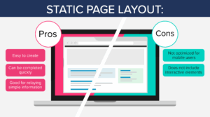
Your nonprofit might choose a static website design if:
- You just want to convey basic information like fundraising event flyers, volunteer opportunities, or your organization’s mission statement on your website.
- You need a cost-effective way to set up a website in a short timeframe.
- Your website won’t change very often.
- You don’t need to include interactive elements such as an online merchandise shop, forums, or social sharing options to accomplish your website’s goals.
Due to page size limitations, this layout requires a separate, mobile-friendly version to be successful. Otherwise, important information can be lost to mobile users.
3. Liquid or fluid design layout
Liquid design layouts, sometimes referred to as fluid layouts, have flexible page dimensions rather than rigid, permanent sizes. With a liquid layout, the page will always fit the size of the user’s screen, no matter what browser they are using.
However, this layout doesn’t always resize to fit every screen perfectly. For example, a large browser might stretch content while a small one can push content together, making it difficult to read. While these flexible page dimensions are a step up from what static layouts provide, a liquid layout is still susceptible to providing a poor user experience.
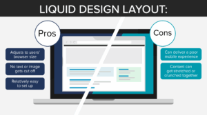
Consider choosing this layout for your nonprofit web design if:
- You don’t have the time or resources to create a separate mobile-friendly website.
- You want to improve user experience, but don’t have the resources to take on a more advanced layout.
- You want to ensure that users have access to important information regardless of their device.
If you need a quick and implementable web design but don’t want the drawbacks of a static design, liquid layouts might be the best option for your nonprofit.
4. Adaptive website layout
Similar to a liquid layout, adaptive web designs change size depending on the size of the user’s browser. However, this style uses queries in a coding language called Cascading Style Sheets (CSS) to detect the size of the browser and adjust accordingly, while liquid layouts only use HTML coding.
Adaptive websites tend to make more accurate size adjustments than liquid layouts. Additionally, adaptive layouts change the actual content on the page to the user’s screen so they have a better user experience viewing and navigating the site. With a smarter, more flexible layout like this one, you can build a better website that won’t entail any frustrating issues like stretched-out images and stacked or overlapping text.
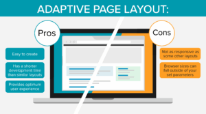
An adaptive website layout might be right for your nonprofit if:
- You want a website that prioritizes user experience.
- You want to preserve your website’s design integrity across all device types.
- You want to build a website with an excellent user experience on a relatively tight timeline when compared to more complex layouts.
While its adaptive features might not always work perfectly for atypical browser sizes, this layout can make your website more user-friendly while using less time and resources than other, more complex web designs.
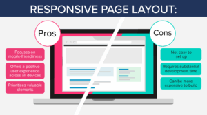
5. Responsive design layout
Responsive design layouts adjust their layouts and how information is displayed based on the user’s browser size. What makes these layouts unique, however, is that they are built with a mobile-first approach.
With 64.35% of all website visits coming from mobile devices, the importance of providing a positive user experience on these devices cannot be overstated. A responsive design layout prioritizes these users’ preferences by building out the mobile version of the website first.
This layout adjusts on-page elements to each browser size so users never miss important information on your website. For example, it wraps text and scales images accordingly so mobile users can view the same elements that appear for desktop users. These layouts also prioritize showing the most important elements of the page, like the headline of a blog post, at the top rather than decorative elements.
Your nonprofit might benefit from this layout if:
- You have the time and resources to develop a more complex website.
- You want a web design that prioritizes mobile users.
- You want to provide the best possible user experience.
- You don’t want to build a separate mobile website.
This layout is one of the best ways to ensure users have a positive, seamless experience on your website, no matter what browser they are using. Be sure to account for the longer lead time on website development, as this type of design is often more complex to set up.
6. Dynamic website layout
Dynamic web designs are personalized to each user who visits them. The appearance of on-page elements like text and images will change from visitor to visitor. These layouts also incorporate more interactive elements.
Often, dynamic web designs are used for sites where users log in to a unique profile, including e-commerce and social media websites. Think back to the last time you logged into your Amazon account, for example. Chances are, the website adapted its layout to include personalized features like your name at the top of the page and alerts about new deals on products similar to your previous purchases.
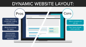
Dynamic layouts are a great option if:
- Your nonprofit’s website content will change regularly.
- Your site allows users to log in to unique user profiles.
- You plan to use your website to sell a product like branded merchandise.
- You’re looking for a layout with increased functionality and interactivity that doesn’t require extensive coding experience to build.
If your team is exploring using a dynamic web design, keep in mind that page load speeds can be slower because the page has to fill in the users’ data when they request the page. Take measures to reduce page load speeds, like compressing all your image files and minimizing CSS and JavaScript.
Using a CMS like HubSpot for nonprofits can make it easier to execute more complicated designs like these. Train your staff on its use or hire a consultant to maximize the potential of these tools.
What are some tips for improved nonprofit web design?
In addition to the more technical aspects of web design, there are creative aspects to consider as well. Many of these elements use graphic design strategies to stand out by conveying information in a compelling, readable way. Here are a few that your organization can use to strengthen your web design.
Get creative with media.
If you’ve ever visited a website that featured text as its only media source, you know how dull and uninteresting it can be to browse those sites. While images are certainly a step up from plain text, there is only so much you can convey with still images alone. That’s where more creative, dynamic media comes in.
Media like videos and GIFs can convey your marketing messaging through a more interactive and engaging channel. Videos can make a strong impact by capturing and conveying strong emotions by incorporating a blend of powerful elements like footage, music, and narration.
Also, consider incorporating innovative, highly interactive elements like quizzes, calculators, and interactive infographics. For example, if you run an animal rescue, you could include a tool that calculates how many dogs a potential donor’s gift would impact. Elements like these engage your supporters, keeping them on your website longer and moving them closer to donating.
Choose a cohesive color palette.
Be deliberate with the colors you incorporate into your website. For example, you should always choose text colors that contrast strongly with your website’s background colors to make the page as accessible as possible. However, you should also focus on choosing a cohesive overarching color scheme that you use throughout your website.
A well-developed color scheme can:
- Strengthen your branding. Choose colors that are consistent with your nonprofit’s branding. Then, when people access your website through search engine results pages, web ads, or marketing emails, they can immediately recognize your organization’s branding in the web design. To boost brand recognition even more, include your nonprofit’s logo in a prominent place.
- Reinforce your mission. People often have subconscious assumptions about colors’ meanings. For example, when you spot a nonprofit organization with a lot of green in its web and logo design, you probably assume its cause has something to do with nature or the environment. Choosing a color that people might already associate with your cause is a great way to signal your mission visually.
As you choose your color scheme, take care not to get carried away. Using too many colors on your website or in your organization’s branding can muddy your brand identity and make it difficult for supporters to recognize your organization.
Draw inspiration from others—but maintain your originality.
Taking a look at examples of nonprofit websites that successfully implement different design strategies is a good first step when designing or redesigning your organization’s site. You’ll see what works well in terms of navigation, visuals, and messaging, which can inspire your own website design.
As you peruse other sites, keep these questions in mind:
- How is this organization’s mission similar to or different from ours?
- What features grab my attention immediately?
- Which design features are the most effective? Which aren’t working?
- Are there ideas I can see translating into our organization’s voice?
However, keep in mind that your nonprofit’s mission and audience are unique. Use your own branding and content to avoid creating a generic site. This will help readers see why they should choose your organization and help you attract the right audience.
By blending inspiration with originality, you’ll build a nonprofit website that’s professional, familiar to visitors, and unmistakably your own.
Work with a consultant.
DIY websites may work for some organizations with minimal need for customization and existing web design skills, but there’s no substitute for real expertise. A nonprofit consulting firm can guide your organization through the entire web design process, ensuring your site is both visually compelling and strategically effective.
Here are some ways a consultant can strengthen your web design efforts:
- Translate your mission into design. Consultants can turn your brand identity and storytelling goals into a site layout, color scheme, and user experience that resonates with supporters.
- Focus on usability and accessibility. They’ll make sure your website is intuitive for visitors of all abilities, with features like clear navigation, mobile responsiveness, and ADA-compliant design.
- Integrate key nonprofit tools. From online giving forms to volunteer sign-ups, consultants ensure your web design supports core nonprofit functions and connects seamlessly with platforms like Salesforce or Blackbaud. This means supporter data flows directly into your CRM, reducing manual entry and improving donor management.
- Plan for long-term updates. Beyond launch, consultants often provide training or ongoing support so your staff can keep content fresh without relying on outside help for every change.
Choose a consultant with relevant expertise who understands your specific mission and is well-versed in the technology your nonprofit wants to implement. Check testimonials and references for organizations that had similar needs and were satisfied with their service. As your partnership continues, be open to the new perspectives your consultant will bring to the table.
Wrapping Up
An impactful, user-friendly website can motivate visitors to learn more about your organization and find ways to get involved. As a central information hub, you can direct all prospective supporters to your site to educate and connect with them. Use the tips in this guide as a starting point on your web design journey, but don’t be afraid to reach out to the experts when you have questions!
If you’re curious about leveling up your organization’s graphic design strategy, check out these additional resources:
- 100+ Best Nonprofit Logos to Inspire Your Team. Looking to update your logo? These logos can give your team much-needed inspiration.
- 15 Best Nonprofit Graphic Design Examples. Quality graphic design is crucial to building your brand as a nonprofit. Get inspired with these 15 examples of how nonprofits can use graphic design in their marketing strategies.
- Demystifying the Google Ad Grants Website Policy: A Guide. Ready to take your digital marketing to the next level? Check out this resource all about the Google Ad Grant.